Enterprise Product Design · Case Study

PulseOps

When infrastructure fails, clarity saves time.

PulseOps is an enterprise incident intelligence platform designed for DevOps engineers and SRE teams. It reimagines what happens in the 38 minutes between "something is wrong" and "the system is stable again" — replacing fragmented tooling with a single, coherent investigation experience.

RoleSolo Product Designer
TypePortfolio Concept
FocusEnterprise UX · Incident Response

Monitoring tools are powerful. But in a crisis, they feel hard to think with.

Modern infrastructure monitoring has matured enormously — yet when a critical incident occurs, engineers still spend the first critical minutes jumping between tabs, parsing alerts, and assembling a mental picture that no single tool gives them.

The problem is not a lack of data. Production systems generate enormous amounts of telemetry. The problem is orientation — understanding what broke, how far the failure has spread, what depends on the affected component, and what to do next — all under pressure, often in the middle of the night.

Most platforms are built around the idea of showing everything. PulseOps was designed around a different question: what does an engineer actually need to know right now?

"The hardest part of an incident isn't fixing it. It's figuring out what is actually happening while everything is on fire."

Core problem statement
Average response time 38min

Mean time between alert trigger and confirmed root cause identification in complex distributed systems.

Context switches 4–7

Average number of separate tools or views an engineer opens during a typical critical incident investigation.

Alert fatigue rate ~60%

Share of monitoring alerts teams report as noisy or not directly actionable during an active incident.

The fragmentation problem

Today's DevOps tooling is best-in-class for individual tasks — metrics, logs, tracing, alerting — but the tools don't talk to each other in a way that supports investigation as a workflow. Engineers have to hold the full picture in their heads while switching between tools, a cognitive cost that compounds under pressure.

Alert dashboardsSurface signals but don't show relationships or propagation.
Log toolsDeep for diagnosis but poor for fast triage and orientation.
Incident trackersGood for coordination but disconnected from live system data.
Service mapsOften siloed in separate platform areas, not linked to active incidents.

What PulseOps addresses

Rather than adding another tool, PulseOps is designed as the connective layer — a platform that treats detection, triage, diagnosis, and review as a single continuous workflow. Every view connects to the next logical step an engineer needs to take.

Detection → TriageAlerts link directly to the full incident context without manual lookup.
Triage → DiagnosisEach incident surfaces correlated metrics, logs, and AI anomaly signals.
Diagnosis → ReviewRoot cause findings flow into post-incident reports automatically.

Three distinct people, one shared moment of pressure.

PulseOps serves a focused user set — the people who are paged at 2 AM, the engineers responsible for reliability contracts, and the leads trying to coordinate response across a team. Each of them approaches an incident with different needs, different contexts, and a different definition of "resolved."

Primary User

DevOps Engineer

On-call first responder. Receives the alert, triages the incident, coordinates a fix. Works fast, under pressure, needs context immediately.

  • Needs to understand scope fast
  • Wants one screen per task
  • Trusts metrics over guesswork
  • Hates switching between tabs
Core User

SRE

Owns reliability metrics, SLOs, and postmortems. Uses the platform for both live incidents and retrospective analysis to prevent recurrence.

  • Cares deeply about root cause
  • Wants trend data, not just snapshots
  • Writes post-incident reports
  • Advocates for systemic fixes
Secondary User

Engineering Lead

Manages escalations, communicates status to stakeholders, and tracks team workload. Needs high-level signal, not operational detail.

  • Needs status at a glance
  • Wants to know who owns what
  • Reviews reports and trends
  • Escalates when needed

Designing for the DevOps engineer under pressure meant designing for everyone else too — clarity and speed benefit all roles.

User strategy

A key design implication of this user set: the product must serve two different reading speeds simultaneously. During an active incident, the DevOps engineer needs to scan fast and act. In calmer moments — when reviewing trends, writing reports, or planning improvements — the SRE wants to read carefully and go deep. The interface has to support both without feeling schizophrenic.

I researched the space the way you would before designing for a real engineering team.

This is a portfolio concept, but I approached the research phase as if I had access to real users. I drew from competitive analysis of existing platforms, published SRE literature, industry incident retrospectives, and public engineering blogs where teams have documented their real operational pain points.

Method 01

Competitive analysis

Studied Datadog, PagerDuty, Grafana, New Relic, and Opsgenie. Each has strengths in specific layers — monitoring, alerting, or reporting — but none unifies the full investigation workflow in a single coherent experience. Most feel like collections of powerful features rather than products designed around a workflow.

Method 02

Industry incident reports

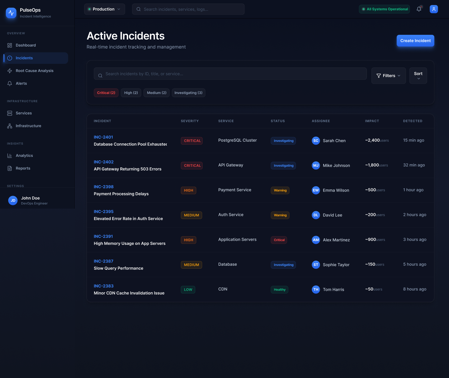
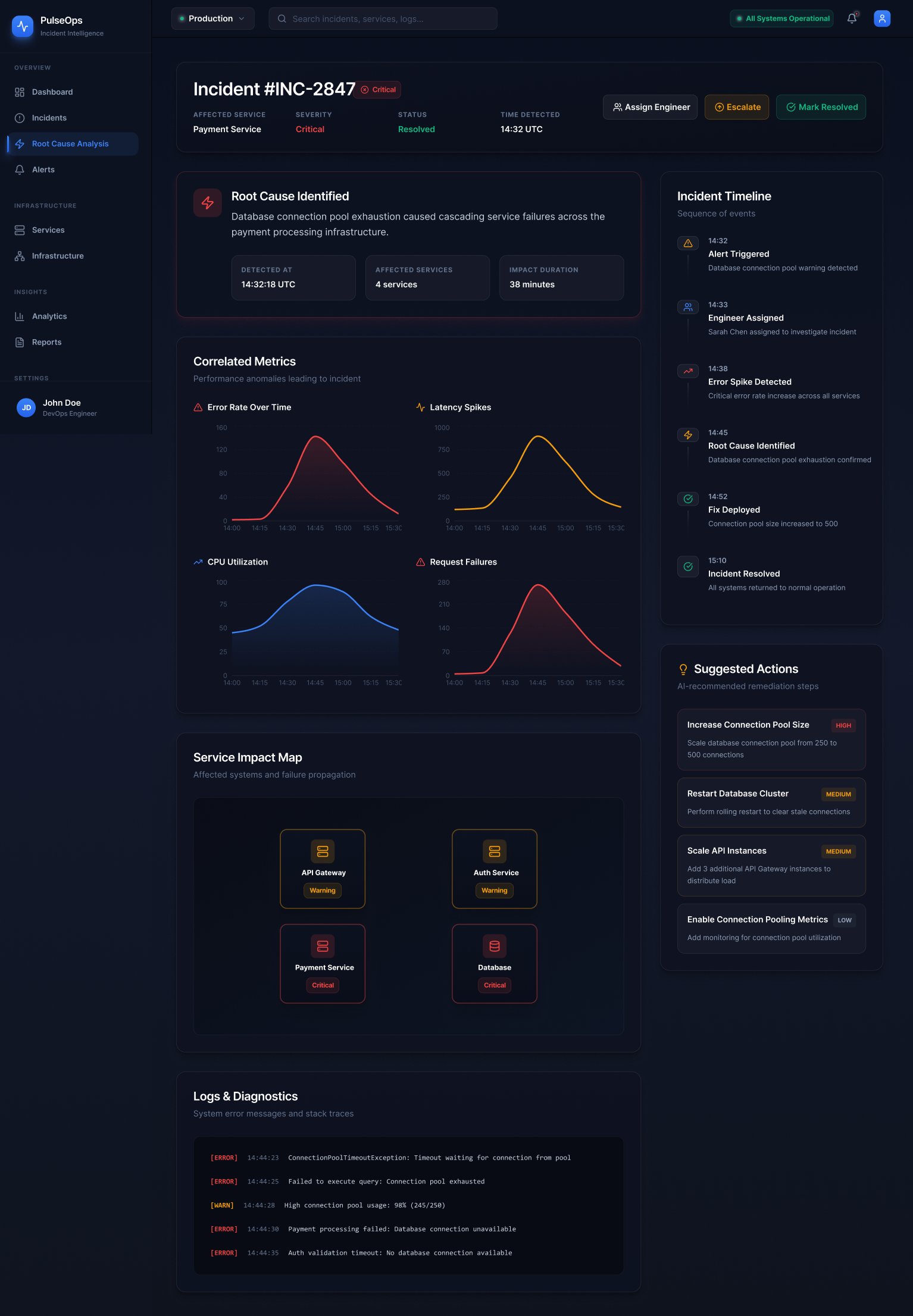
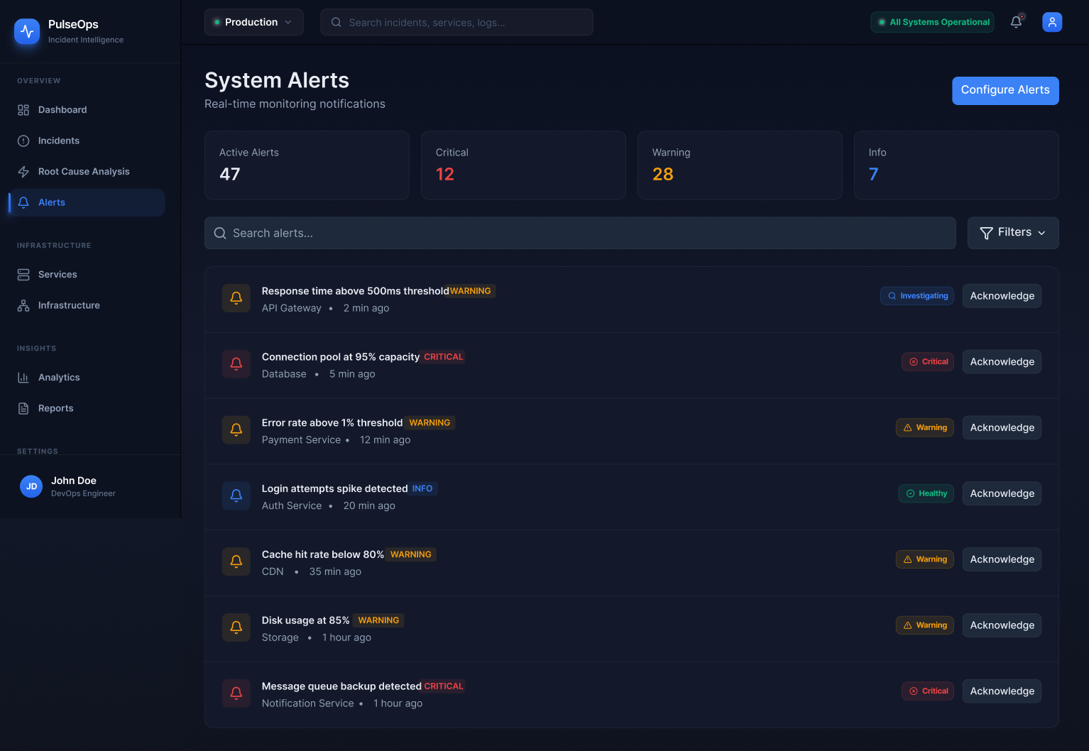
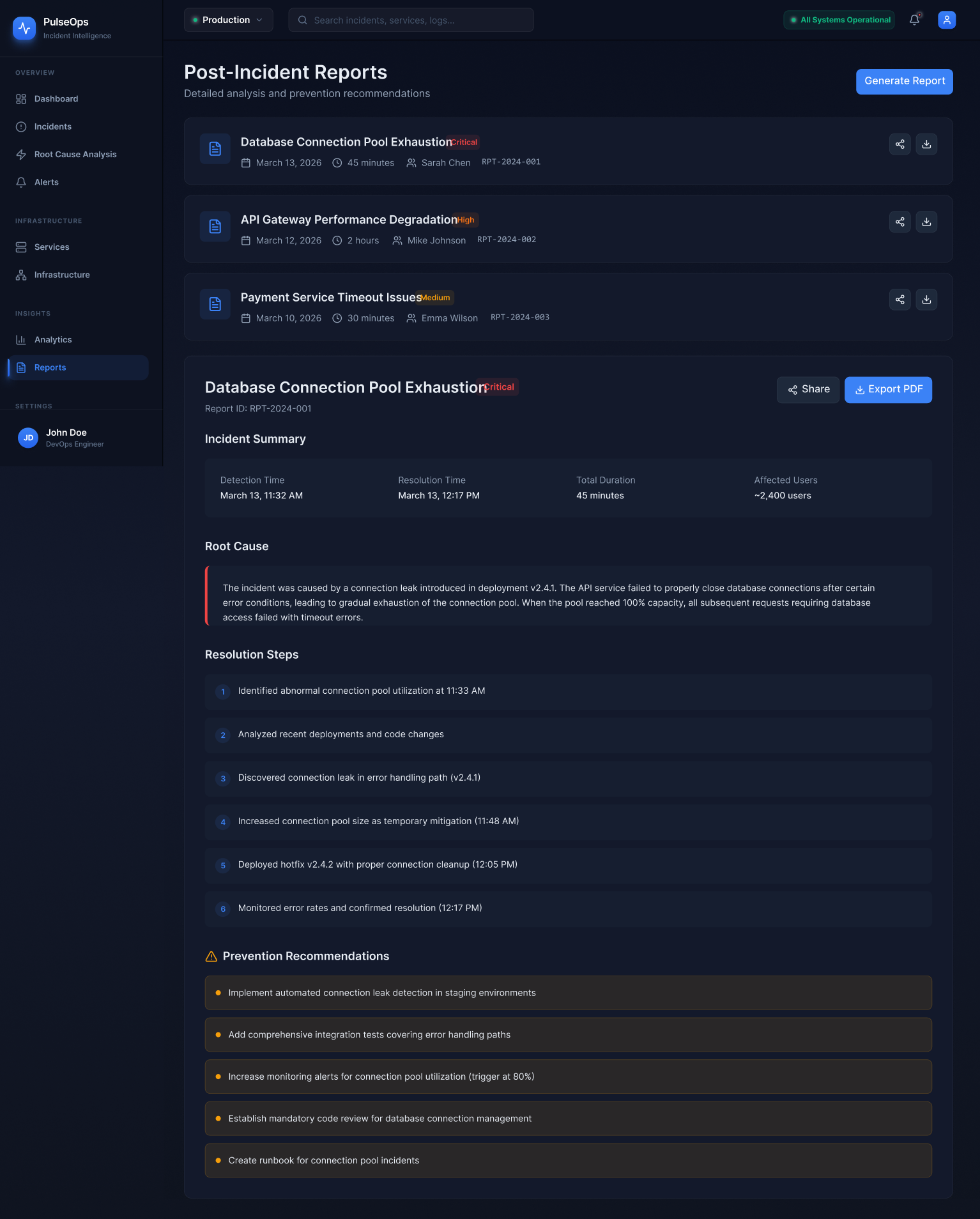
Analysed public postmortems from companies including GitHub, Cloudflare, Stripe, and Shopify. A recurring pattern: the most costly part of incidents was not fixing the problem — it was the first 10–15 minutes of trying to understand what was actually broken and how far the impact had spread.

Method 03

SRE literature & Google's SRE book

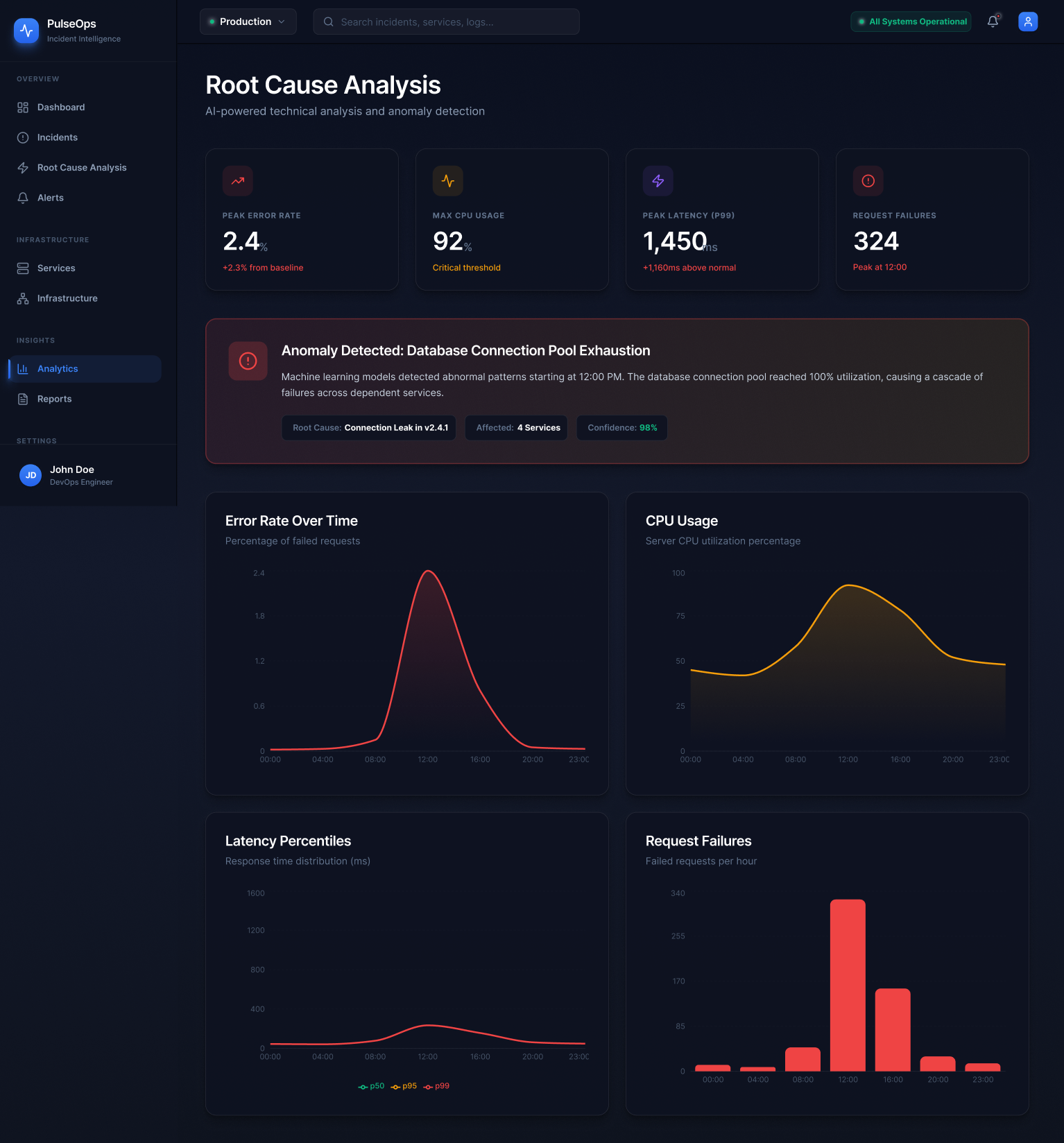
The Google SRE book and Betsy Beyer's follow-up work shaped how I thought about the operational lifecycle — detection, triage, mitigation, and postmortem as a complete cycle. This became the backbone of PulseOps's navigation model.

Method 04

Engineering blog analysis

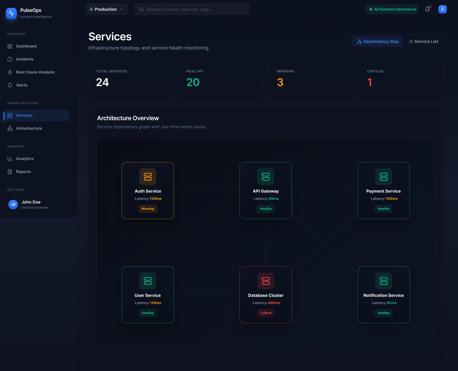
Engineering blogs from Netflix, Discord, Figma, and Linear surfaced recurring observations: engineers want their tools to surface relationships, not just raw data. The ability to understand "what depends on what" and "where did this start" emerged as the most underserved need.

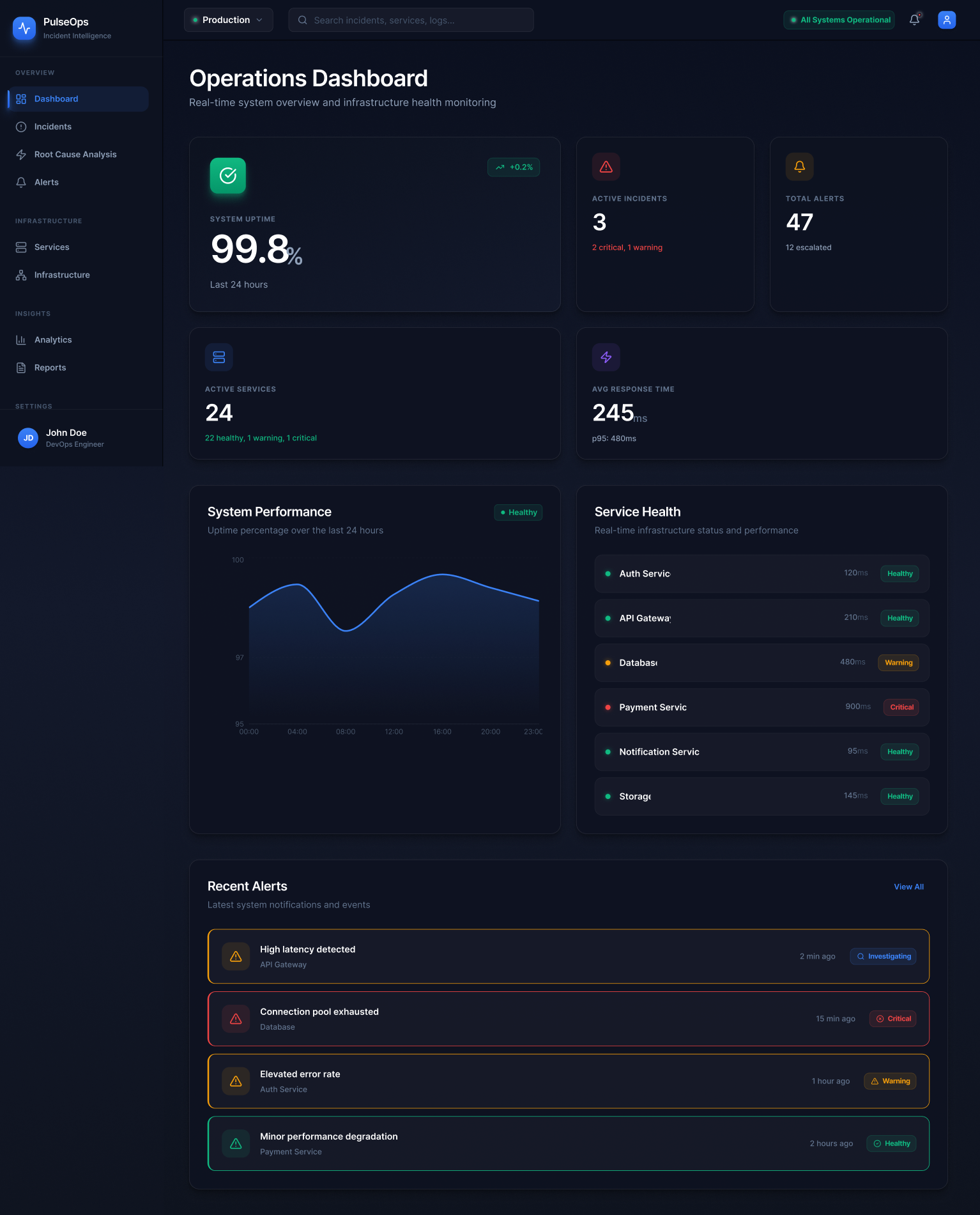
The research kept returning to one word: orientation. Engineers don't need more data. They need to know where they are in the problem.

Research synthesis

I also looked closely at the information architecture of existing tools — how they group features, what they treat as primary navigation, and where they force context switches. Almost universally, the investigation workflow is split across at least three separate product areas. That fragmentation informed the core IA decision in PulseOps: treat detection, triage, diagnosis, and review as a single vertical, not as separate products bolted together.

Five insights that shaped every design decision that followed.

The research converged on a set of clear, recurring observations about how engineers experience incidents and what existing tools fail to provide. These insights were not just inputs — they became the evaluation criteria for every design choice in PulseOps.

01

Cognitive load peaks exactly when clarity matters most

During an active incident, the brain is already under stress. Any interface element that requires interpretation — ambiguous iconography, inconsistent status labels, competing visual weights — adds friction at the worst possible moment. Enterprise tools that feel powerful during demos often fail in production because they were designed to look comprehensive, not to reduce cognitive load under stress.

Information Architecture
02

Service relationships are the missing layer in most monitoring UIs

When engineers see an alert, their first question is rarely "what's broken?" — they already know that. Their first question is "what does this affect?" Existing tools surface individual service metrics well, but they almost never make service dependencies visible in context during an active incident. Understanding propagation — the blast radius of a failure — is critical and deeply underserved.

Systems Thinking
03

The fastest diagnosis happens when context is already assembled

In current workflows, engineers manually correlate alerts with metrics, logs, and deployment history to find root cause. This correlation work is repetitive, error-prone, and slow. The insight here is not that AI is the solution — it's that the interface should pre-assemble relevant context so engineers can evaluate signals rather than gather them. Whether that's done algorithmically or through smart data layout, the principle is the same.

AI-assisted workflows
04

Alert volume is a design failure, not an operational reality

When systems generate hundreds of alerts per hour, engineers stop reading them. Alert fatigue is not a monitoring problem — it's a design problem. The interface needs to actively help users distinguish signals that require attention from those that are informational. Severity, recency, and impact scope are not just metadata; they're the primary interface for triage and they deserve to be treated as first-class design elements.

Alerts Design
05

Post-incident work is treated as a chore, not a feature

Most monitoring products stop at resolution. They help teams detect and respond, but they don't create any structure around learning. Post-incident reports are usually written in external docs, disconnected from the actual investigation data. When the platform can generate and scaffold those reports from the investigation context, the quality of postmortems improves and teams are more likely to actually complete them — closing the operational feedback loop.

Operational Lifecycle

Every design decision was a direct response to a research finding.

This section maps the key design choices in PulseOps back to the insights that drove them. Good enterprise design isn't about aesthetics first — it's about understanding operational reality and building an interface that reflects it accurately.

Decision 01

One workflow, not a feature collection

The entire platform is organized around the incident lifecycle — monitor, detect, triage, diagnose, review — rather than by feature type. Navigation follows the user's mental workflow during an incident, not the product team's internal taxonomy.

Decision 02

Dark, high-contrast visual system

Dark mode wasn't chosen for aesthetics — it was the right choice for an environment where screens are often read in dim server rooms or late at night. High contrast between critical, warning, and healthy states makes status scannable in under two seconds.

Decision 03

AI root cause as a first-class feature

Machine learning anomaly detection is surfaced prominently in the investigation view — not tucked into a sidebar. The confidence score and affected service count give engineers enough signal to evaluate the suggestion without blindly trusting it.

Decision 04

Service dependency map in the product core

The architecture overview lives in the main infrastructure area, not in a separate observability product. During an incident, seeing which services depend on the failing component is critical. Making this visible in context — not behind a separate tool — reduces context switching significantly.

Decision 05

Incident timeline as the primary narrative

Every incident has a story — what triggered the alert, when an engineer was assigned, when root cause was found, when the fix was deployed. Presenting this as a chronological timeline in the investigation view helps teams coordinate and gives leads a quick status view without needing a separate briefing.

Decision 06

Reports as part of the platform, not an export

Post-incident reports are generated from the investigation data already captured in the system. This removes the friction of writing a postmortem from memory and increases the chance teams complete them — turning each incident into a recorded learning event.

The hardest design decisions weren't about what to add. They were about what to leave out — choosing what information an engineer needs right now versus what can wait.

Design philosophy

Information hierarchy principles

Across every screen, I applied a consistent hierarchy logic that prioritizes operationally critical information over completeness.

Status before detailIs the system healthy or not? That question must be answerable within 2 seconds on every primary view.
Severity is visual, not textualCritical incidents and alerts use color, not just labels — because color is processed faster than text under stress.
Actions surface contextuallyAcknowledge, Escalate, Mark Resolved — these appear in context, not in a remote settings panel.
Drill-down, not sidewaysThe navigation model keeps engineers moving deeper into one incident rather than navigating laterally to separate tools.

Technical UX considerations

Designing for a DevOps audience means respecting technical literacy. The interface doesn't over-explain — it uses the language engineers already know.

INC numbering systemIncident IDs (INC-2401) mirror real operational conventions — they're how engineers talk about incidents in Slack and runbooks.
P50/P95/P99 latency percentilesStandard SRE notation, not simplified. These users know what these mean and expect to see them.
Correlated metrics layoutError rate, latency, CPU, and request failures are shown together because causality runs between them.
Confidence scoring on AI analysis98% confidence with a named root cause gives engineers enough signal to act without replacing their judgment.

A complete investigation experience, from first alert to final report.

PulseOps is a nine-screen product that covers the full incident lifecycle without requiring engineers to leave the platform. Each screen connects to the next. Each view answers one clear operational question before passing the user forward.

01 / Orientation

Operations Dashboard

The dashboard answers the most fundamental operational question — is the system healthy right now? — before offering any detail. Uptime, active incidents, alert counts, and service health are surfaced in order of operational priority, not visual symmetry.

Design decisionSystem uptime (99.8%) is the hero metric — it's the one number engineering leadership cares about most and the first anchor an engineer needs during triage.
Service health panelShows response times and status for all critical services at a glance. Color-coded status badges (Healthy / Warning / Critical) make the system state readable in under three seconds.
Dashboard
PulseOps operations dashboard
Active Incidents
PulseOps incidents list
02 / Triage

Incident Management

The incidents view turns raw system events into a prioritizable list. Severity, service, assignee, user impact, and time detected are all visible at row level — so engineers can make a triage decision without opening a single incident first.

Technical detailImpact is shown as approximate user count (~2,400 users) rather than a percentage — because "2,400 users affected" is a more operationally meaningful statement than "0.6% of traffic."
Filter chipsCritical (2), High (2), Investigating (3) — allow one-click narrowing to the most urgent incidents without a full filter panel interaction.
03 / Investigation

Root Cause Analysis

This is the most technically complex screen — and the one that most directly addresses the core problem. It surfaces correlated metrics, AI anomaly detection, an incident timeline, service impact mapping, suggested actions, and raw logs in one unified view.

AI anomaly bannerMachine learning models flagged the database connection pool exhaustion at 14:32 UTC with 98% confidence. The banner shows root cause, affected services, and confidence score — all the context needed to evaluate the finding quickly.
Service impact mapFour services shown as cards with their status (API Gateway: Warning, Database: Critical) — giving engineers an immediate visual of the blast radius without opening a separate service map tool.
Incident timelineChronological sequence from alert trigger to resolution — supports coordination, status communication, and later becomes the foundation for the post-incident report.
Root Cause Analysis
PulseOps root cause analysis view
System Alerts
PulseOps system alerts
04 / Signal management

System Alerts

47 active alerts. Instead of presenting them as a flat, equally-weighted list, PulseOps groups them by severity with individual status indicators — so engineers can acknowledge contextually rather than processing the list top to bottom.

Severity taxonomyCritical (12), Warning (28), Info (7). The counts at the top give engineers an immediate sense of the noise level before reading a single alert title.
Status per alertInvestigating, Critical, Warning, Healthy — each alert has its own status badge, supporting triage decisions at the row level without opening a detail panel.
05 / System topology

Services Architecture

The services view makes infrastructure relationships visible — which services exist, how they connect, and where degradation is occurring right now. This directly addresses the second insight: engineers need to see propagation, not just the failing component.

Dependency graphSix services shown with real-time latency values and status. The Database Cluster (Critical, 480ms) is visually distinct from the healthy services — its position in the graph immediately suggests which services are at risk of cascading failure.
Architecture overviewShowing the topology in the product core — not behind a separate observability tool — means engineers can check service relationships during an active incident without changing contexts.
Services
PulseOps services architecture
Infrastructure
PulseOps infrastructure monitoring
06 / Resource monitoring

Infrastructure

A dedicated layer for resource metrics — CPU, memory, network throughput, and disk I/O — presented as time-series charts over 24 hours. This view provides the raw telemetry layer that contextualizes alert signals and supports deeper diagnosis.

Design principleMetrics are treated as supporting evidence for a diagnosis, not as the primary interface. The charts don't compete with each other — they're arranged to tell a coherent resource story.
Color encodingBlue for CPU, purple for memory, red for disk I/O — each chart has its own identity within a unified visual system, making pattern-matching across charts easier.
07 / Analytics

Analytics & Anomaly View

The analytics screen provides a deeper analytical layer — time-series data on error rates, CPU usage, latency percentiles, and request failures. It contextualizes what the AI flagged in the root cause view with the full day's data.

Key design momentThe anomaly detection banner (Database Connection Pool Exhaustion, 98% confidence) sits above the charts — connecting the AI finding to the raw metric evidence that supports it.
Chart selectionError rate, CPU, latency percentiles, and request failures are the four most diagnostically correlated metrics — showing them together in one view makes causality visible.
Analytics
PulseOps analytics view
Reports
PulseOps post-incident reports
08 / Learning loop

Post-Incident Reports

PulseOps closes the operational loop with structured post-incident reports generated from the investigation data. The report for INC-2401 captures detection time, resolution time, total duration, affected users, root cause, resolution steps, and prevention recommendations.

Why this mattersMost platforms stop at resolution. This screen represents the learning layer — turning incidents into documented, searchable records that improve the team's operational intelligence over time.
Report scaffoldThe structure (Summary → Root Cause → Resolution Steps → Prevention Recommendations) mirrors the format used by leading engineering teams in their public postmortems.
Navigation modelDashboard → Incidents → Root Cause → Alerts → Services → Infrastructure → Analytics → Reports → Settings
Core UX principleMove from broad signal to precise diagnosis without changing mental context
Visual principleContrast, spacing, and hierarchy before decoration — always

What PulseOps demonstrates — and what it would do in production.

As a portfolio concept grounded in real operational workflows, PulseOps has both design outcomes and hypothetical product outcomes. The design outcomes are demonstrable. The product outcomes are what the platform would realistically achieve if deployed to an engineering team.

Design outcome

Coherent enterprise product story

Nine screens that behave like one product, not nine isolated interfaces. Every view connects to the next step in the operational workflow — making the case study readable as a product experience, not a portfolio of polished frames.

Design outcome

Systems thinking on screen

The service dependency map, the correlated metrics layout, and the AI anomaly banner all demonstrate the ability to design for complex technical relationships — not just clean, simple interfaces. Enterprise design requires both.

Hypothetical product impact

Reduced mean time to resolve

By consolidating detection, triage, investigation, and reporting in one workflow, PulseOps would meaningfully reduce the context-switching overhead that inflates incident duration. Pre-assembled investigation context and AI anomaly detection would shrink the diagnosis phase — the most cognitively expensive part of incident response.

Hypothetical product impact

Higher-quality postmortems

When reports are generated from investigation data rather than reconstructed from memory, the quality and completion rate of post-incident reviews improves significantly. This closes the operational feedback loop — turning every incident into a documented improvement opportunity rather than a forgotten fire drill.

The strongest signal that a design concept works is not that it looks good. It's that it makes the operational problem feel solvable.

Project reflection

This project demonstrates product thinking across the full range of what enterprise UX demands: information architecture grounded in real workflows, visual hierarchy that serves fast decision-making under pressure, technical literacy in both the domain language and the interface conventions, and an understanding of how a product's structure supports or undermines the people using it.

What this project shows

The ability to design a believable, technically grounded enterprise product from first principles — without making it visually cold or generically "B2B." Complexity handled cleanly, workflow design with a real operational backbone, and the discipline to make every screen belong to one coherent product.

Enterprise information architectureNine screens, one coherent navigation model, one operational workflow.
Technical domain competenceCorrect use of SRE conventions, metrics notation, incident nomenclature.
AI integration in UXAI as investigation support, not as a gimmick — with transparent confidence scoring.
Visual system disciplineConsistent color semantics, typography hierarchy, and dark-mode craft.

What comes next

If I were to expand this concept into a higher-fidelity or production-ready design, these are the areas I'd develop next.

Collaborative incident responseReal-time presence indicators, inline comments, and shared investigation notes for team-based response.
Alert rule managementA dedicated interface for configuring, testing, and refining monitoring thresholds — closing the alert fatigue loop by design.
Runbook integrationSurfacing the relevant runbook steps in context during the investigation view, linked to the specific incident type.
Mobile on-call viewA stripped-down mobile interface for the engineer who is paged at 2 AM and needs the critical context before they get to a laptop.